#135 Twelve highlights of 2025 and future predictions
Dara and Matthew recap 2025 with 12 top highlights, AI, analytics, and the best moments on The Measure Pod.
Will Hayes•19 Dec 2025

Since its release back in May 2016, Data Studio (a free version of Data Studio 360) has made quite a lot of progress on improving its functionality. Of course, it is still in beta, so you might come across some system bugs and limitations, but the Google team is working hard to add new features and fix any issues the user may face, with at least two new releases per month (so far).
I won't go into details as what you can do with the tool, as you can check that using Google Data Studio Help site which includes some useful video tutorials and general overview of the product.
But what if you're a little impatient (like me) and want all these extra features to be ready to use now? Well, you can always try and look for a way around and use your imagination! For example…
Let’s say you want to create a table with data from Google Analytics, showing the pageviews by Channel and compare the totals to the previous period and last year. Something like that:
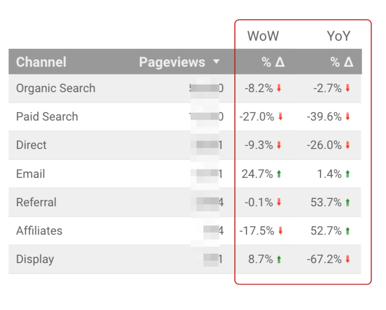
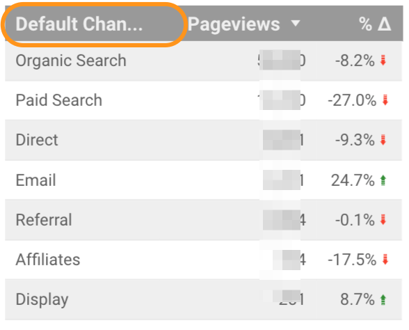
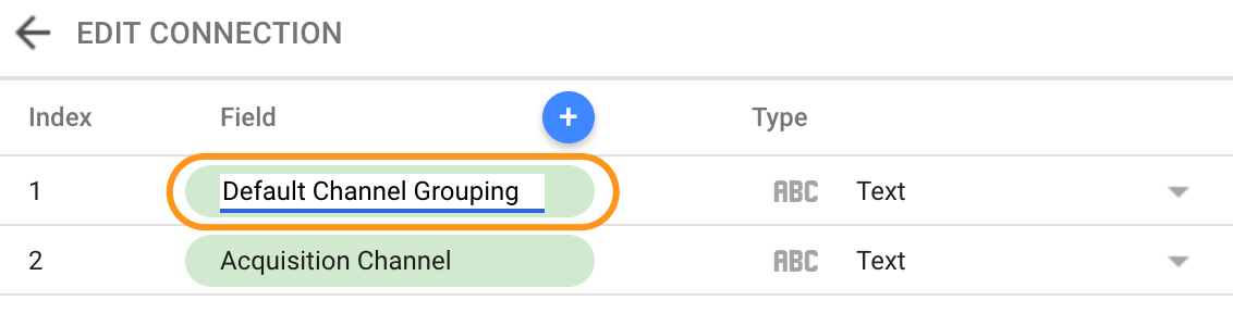
First step is to make sure that the table headings are short and informative. As you know, this is not always the case with the dimensions and metrics that you get from GA. For example, instead of “Channels” you will get “Default Channel Grouping” or a very long “Goal 1 (Goal 1 Completions)” where all you want is simply “Goal 1 Completions” etc.
To solve that, go to your metrics and dimensions list and click on the field you want to update and simply change the name:
Next step is more tricky. At the moment, Data Studio gives you an option to only compare metrics with either previous period or previous year:
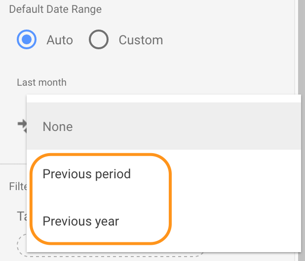
However, you will find that many clients like to see how their data compares to both of these as it will give them a better understanding of trends, and flag any unusual activities on the account.
One way to achieve that would be by creating two separate tables. However, if you are space-limited or just want to see everything in one place you can use this little trick that I found quite handy.
You still need to create two tables, with the same dimensions and metrics, but one will compare data with the previous period and the other with the previous year.
Now using your editing skills, create a rectangular object which will have the same colour as your report’s background (in my case white). You will need that to “cover” some of the data from the second table. The next step is to play around with how the tables are ordered on the report.
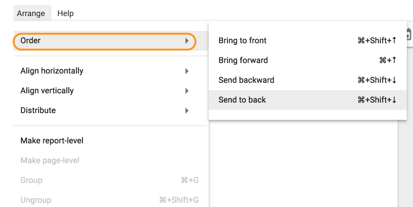
You will need the main table (1) to be brought to front followed by the rectangular object (2) and with the second table (3) send to back. Here is how this experiment would look like on a background that doesn’t match my object:
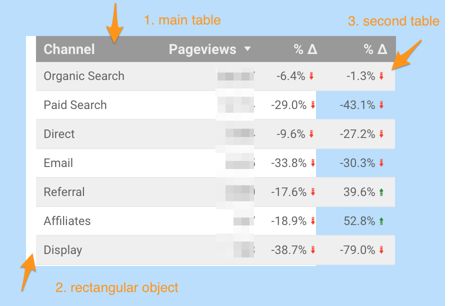
The main reason to have object (2) is to cover the second table data and only show the desired YoY change.
Now, you only need to change the background so that it matches object (2), add some text and formatting, and voila! Now your table shows both comparisons in one neat widget.

Make sure to link both tables to the same source and date range which should be setup to “auto” so that you don’t need to update these manually.
From GA4 implementation to server-side tagging and consent management — we'll make sure your data is accurate and complete.
Our instant analytics audit scans your GA4 configuration and flags what's missing, broken or misconfigured.
Dara and Matthew recap 2025 with 12 top highlights, AI, analytics, and the best moments on The Measure Pod.
AI expert Daniel Hulme, founder of Satalia, shares his journey from UCL PhD to entrepreneur, discussing AI, consciousness & deep tech.
Dara and Matthew chat with Juliana Jackson on her journey, product mindset, and how AI is shaping modern analytics.